
Expressive UI in Material Design 3: A step forward in UX
Say no to minimalism and sameness in design. Research from Google shows design system is evolving and they’re about coherence, emotion, and performance at scale.

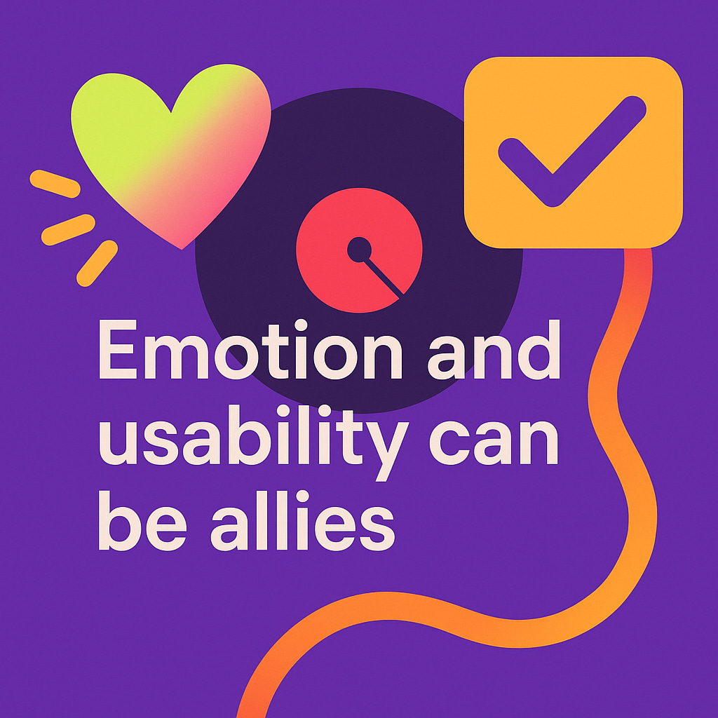
Google’s step toward Material Design 3 Expressive represents more than a visual refresh. It’s a redefinition of what intuitive, emotionally resonant interfaces can be. In the time when many design systems are showing sign of being homogeneous. Google research-backed new design system injected new energy into design conversation. It signals that expressiveness can amplify usability rather than compromise it.
As minimalism matured into a default aesthetic, it sometimes show sign of lacking in emotional engagement. Expressive UI is Google’s way of reintroducing personality, hierarchy, and narrative without losing the clarity we’ve spent years refining.
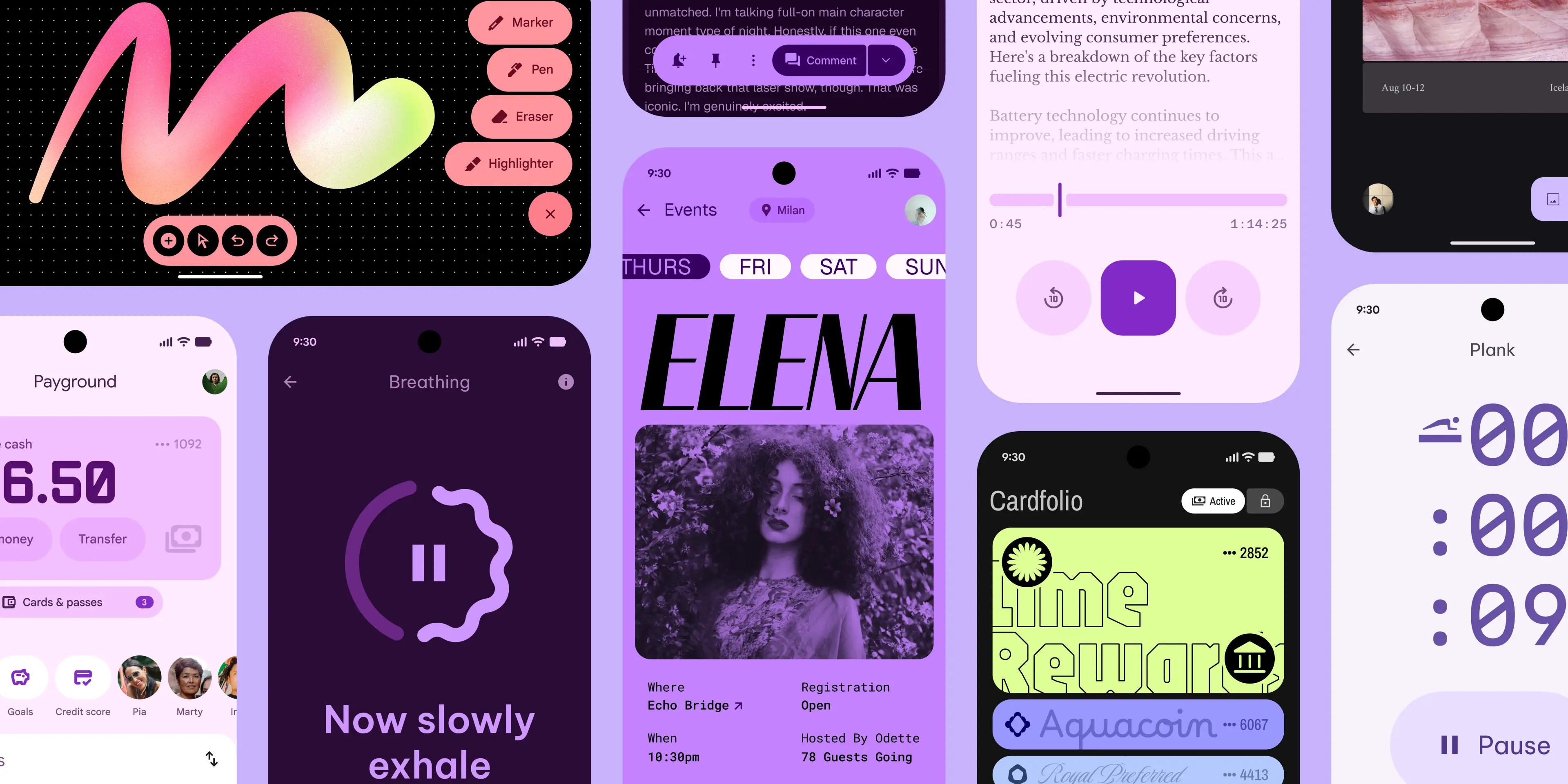
With Material 3 Expressive, we're seeing:
Color used meaningfully to convey state, priority, and tone.
Motion and shape applied with intent, enhancing cognitive processing.
Components that support brand differentiation while remaining system-compliant.
Grounded in Research
What’s particularly compelling about Google’s approach is its foundation in three years of cross-disciplinary research — 46 studies involving over 18,000 participants across age groups, cultures, and contexts.
Eye-tracking studies to measure attention and hierarchy.
A/B testing of motion and shape treatments to quantify perception and usability.
Demographic analysis to validate performance across age and ability ranges.
The findings were conclusive: expressive design doesn’t just look more engaging—it improves scannability, recognition, and interaction efficiency. For example, users identified key UI elements up to 4x faster in their expressive layouts.
Perhaps most notably in my opinion, older users (45+) matched the interaction efficiency of younger users (18–24), closing an interesting usability gap.
Implications for designers
1.
We no longer need to sacrifice usability and performance for expressiveness or playfulness. It’s no longer going to be fun vs function framing or feeling risked of creating distraction using colours, motion and visuals. You can have a playful and impactful branding with engagement together with usability and accessibility. This area would be very interesting for design system designers to measure and test.
colour cue can direct attention faster than monochrome. Especially in dense mobile UI when space and scanning time are limited.
Subtle motion can reinforce system feedback and increase clarity. For example, when using indicating successful state or moving to next available element to draw new focus.
Softened shapes or expressive surfaces can increase perceived affordance. We can make it more clear which element is clickable or tappable.
2.

Design systems have brought extraordinary gains in consistency, efficiency, and accessibility but they've also created a sea of (boring) apps and websites that look the same. But looking into Material design 3, we can now see the components of customisation for different brands. Whether the colour systems, shapes, motion dynamics, and theming parameters within one cohesive system. This allows designers to use different approach to design for brands under the roof of one design system.
From a strategic point of view, the expressive layer becomes a brand signal that embedded directly into the product experience.
3.
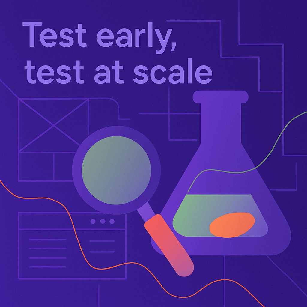
If you’re making design decisions that affect your core system or brand identity, you need research that reflects that level of impact. Investing in scalable and inclusive research infrastructure is no longer optional for mature organisations. Google’s model shows that building for emotional resonance at scale is achievable and the insights has to come early and come from a wide representative base of users.
Takeaway
For those of us building and involving in design systems, this is a time to rethink how to define what is good UI. It’s no longer just about consistency but also about creating products that feel intuitive, expressive, and human (with taste).
Material Design 3 Expressive isn’t just a new look. It’s a data-informed case for another level of UX maturity. The freshness of this reminds us design research is worth looking into and investing in.